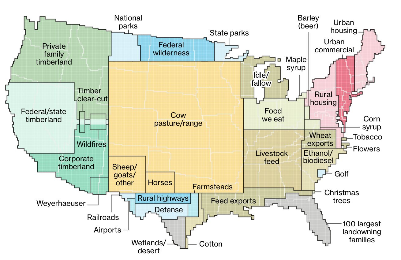
Map Chat: How Land is Used in the United States
We don't use our land very well as it turns out...
Welcome to Map Chat! Every Thursday you’ll get a fresh map made by other cartographers with just a little bit of commentary by me. Enjoy!
This is one of my favorite maps I’ve come across. Originally from 2018, this map was created by Bloomberg writers Dave Merrill and Lauren Leatherby though I’m unsure if they’re the original cartographers. Regardless, I love this map because it cleanly breaks down how we use our land in this country, which is to say, not all that well. Unless you happen to be a rancher, that is. Cow lands, unfortunately are a particularly harmful use of land, as cows pollute both air and water pretty extensively. With that said, here’s the good, the bad and the lie (because all maps lie in some way):
The Good
It’s a pretty map! Just very visually pleasing and easy to read. If you’re at all into land use, you probably will get a kick out of this, at least in terms of national-scale land use.
The Bad
Where’s Alaska and Hawaii? Or for that matter, the rest of the U.S. territories such as Puerto Rico? It seems kind of silly to create a map of land use in the country and leave out large swaths of land. Particularly Alaska because that might skew what we’re seeing a bit. Which leads me to…
The Lie
All maps lie, and this one is no different. In this case, the lie is fairly obvious (which is good thing!): the land use data is grouped to show nice clean “chunks” to more easily illustrate total area of a specific land use, but the reality is it's much more chaotic and spread out. That is to say… the top 100 land owning families don’t own all of Florida, obviously. 😅


