Map Chat: A Different Kind of NYC Subway Transit Map
Transit maps are always fun but this one is so much more
Quick side note: As with last week, I’m forgoing the “good, bad, and lie” portion that I’ve been playing around with for the last few weeks. As it turns , I will likely not be using it again very often, maybe sometimes, but overall I’m just going to use these Thursday newsletters to discuss/talk about maps I find and like (or particularly dislike).
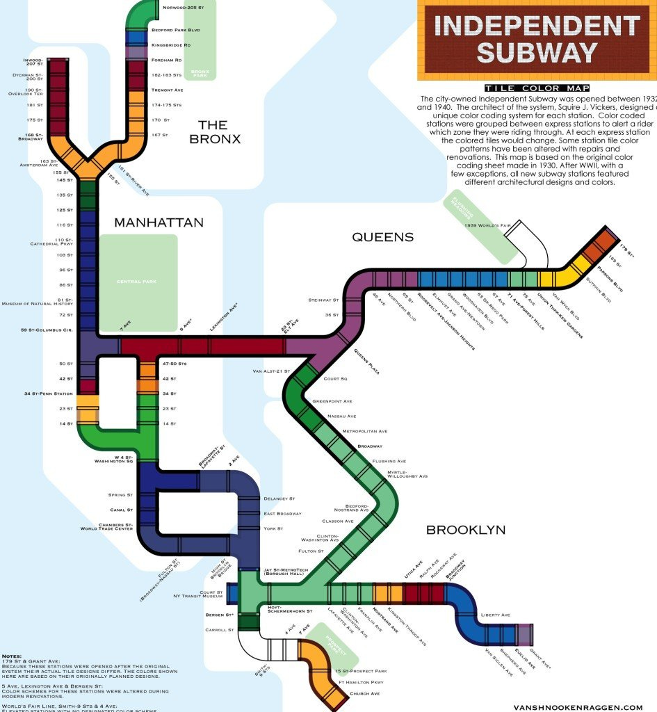
What makes a transit map a transit map? If you’ve at all spent any time exploring the very large and expansive world of transit maps, you’ll likely know what I’m getting at here. Transit maps are almost never spatially or geographically accurate. Instead they’re made up of fat lines that show exaggerated curves and movements to make a complex system of stations and lines easy to read and follow at a quick glance. The idea being, before Google Maps especially, that travelers wouldn’t have a lot of time to figure out where they were or where they were going. This is also why so many transit lines are color coded. There’s a bigger article in the future coming to discuss transit maps in general, but for now, let’s talk about the fat-lined-boi above.
This is a modern revision of a classic NYC subway tile map that was created in the early-mid 1900s and, as you can tell, it’s quite different! Even from a transit map’s perspective, this map sticks out for its almost tube-like lines. When I first saw this map the other week, I thought the tubes looked very similar to Mario Bros. tubes.
Basically the concept behind this map is that it allows riders a quick and visual method (using color theory) to determine when they should be getting off their current line to board another express line. It further helps guide those who might not otherwise have all the information they need to get to where they’re going.
Once you get over the hump of understanding it, it’s quite an ingenious map! Put yourself in the shoes of someone in 1935 and you need to make your way from Kingston Ave in Brooklyn to Queens Plaza in Queens and you can relatively quickly figure out that you need to hop on the yellow local line, hop on the light green express line, hop on the dark green express line, and finish on the local mauve-purple line. Easy-peasy! Well that’s still a lot of transfers, but you get the point.
And just to give you a little more perspective, since some of you might not be familiar with New York’s Subway system at all, here’s a modern transit map:
Different feel to it eh? This map is probably more helpful today, but it lacks the simplistic aesthetic that makes the tube map so much fun.
Unfortunately, or maybe fortunately, Google Maps (and the like) have really made these kinds of maps unnecessary. But that also means we can further explore the concept of transit maps as art and the tube map above definitely works as a piece of art in my opinion.
As usual, thanks for reading!


