Homeless Nation: Data and Trends for the People Who Are Homeless in America (Part 1)
Where are the most homeless? Where are we seeing homeless the most?
Welcome to another two-part series. I promise I won’t make this a habit, but this is a particularly complex issue and I want to be able to give it the space it needs to be fully digested. So this week, I’ll be doing some national maps on homelessness. Next week, we’re going to drill down into the west coast to see what’s happening over here.
—
Homelessness is a complex issue. While many want it to be a black and white issue, the reality is that the reason it’s so hard to fix is because there is no one-size-fits-all solution. The pathways to homelessness varies from person to person and the solutions to getting those people out of homelessness varies from person to person. Of course, there are absolutely some things that could have a bigger impact on addressing homelessness such as a coordinated federal response that’s well funded and managed, but even that will leave some people behind.
The reason I bring this up is because I’ve opted to visualize this through my cartography by “shattering” the country as if it were a broken mirror. This is how we are currently approaching homelessness. Every state for itself. Every city and county working mostly independently of each other. While I’ve received feedback already that it draws the eye to Kansas City/Omaha unfairly (and it does) I’ve opted to leave it because I think the visual acuity helps drive the point home a bit: that we lack any coordinated, meaningful effort on the national level to end homelessness. But make a mental note here: I’m not trying to focus on Kansas City or Omaha, or any other city, in these maps. Got it? Great! Let’s get to it.
Total Homeless
See what I mean about the shatter lines? Again, ignore the lines drawing your eye to Kansas City and Omaha. Power through it.
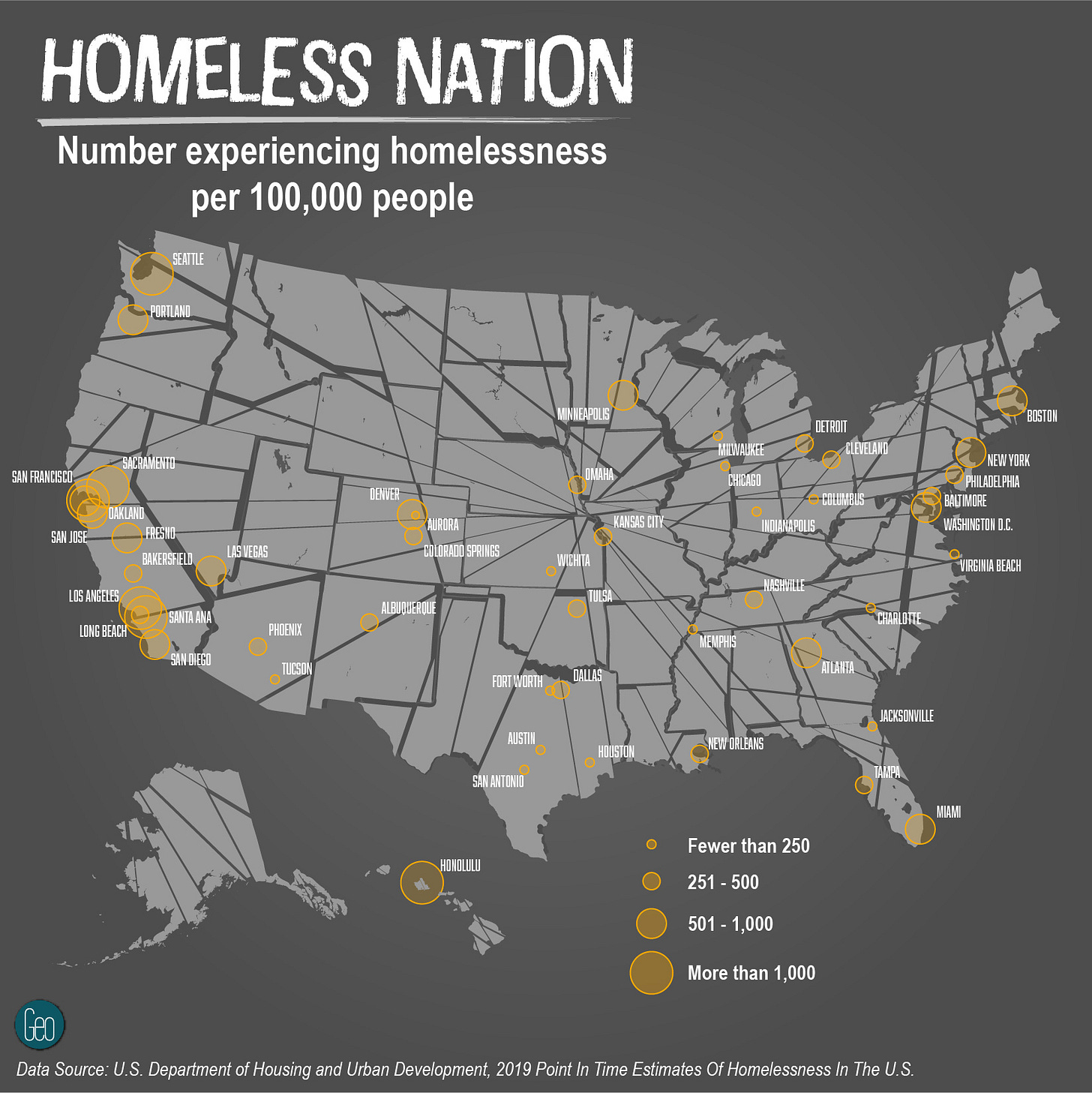
Alright so here we have our total homeless populations. To make it a little easier to compare city to city, I’ve opted to put it as a ratio so it’s one person experiencing homelessness per 100,000 people living in the city. If I didn’t do that, Los Angeles and New York City would absolutely dwarf every other city. Before we dive too much deeper though…
Data caveat! This data comes from the U.S. Department of Housing and Urban Development (HUD). This is nice because it allows for more easily comparable numbers state to state/city to city. However, counting people who are homeless is notoriously challenging. So while these numbers give us a look inside the number of homeless in any given city, they likely are wrong to a degree. Just keep that in mind.
Alright, with that out of the way, some key take aways from this map:
The west coast states (and Hawaii) really are worse than almost every other place in terms of overall amount of homelessness, but maybe not as much as we would have guessed.
I have no idea why Minneapolis has so many more people who are homeless than Milwaukie or Chicago but it sure is interesting.
Texas is doing something to keep the number of overall homeless on the low end, especially for having such a large population.
Overall though, not too many surprises right? I think most people would have guessed that this map would have looked like this if they had even a small bit of background information on homelessness.
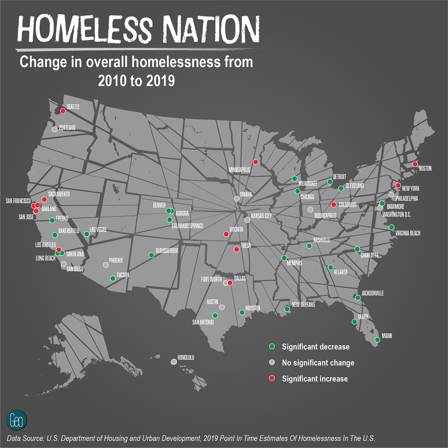
Change in Total Homelessness from 2010-2019
And perhaps some good news for most of the cities listed above. The actual total number of people experiencing homelessness actually decreased in many cities, including many of those in California. This is probably not too surprising given that 2010 was the middle of the worst economic recession in nearly a century. What really stands out to me here is my home city of Portland. In 2010, I would have assumed there were far fewer experiencing homelessness based on what I could see. But maybe that’s because of another reason…
Unsheltered Homeless
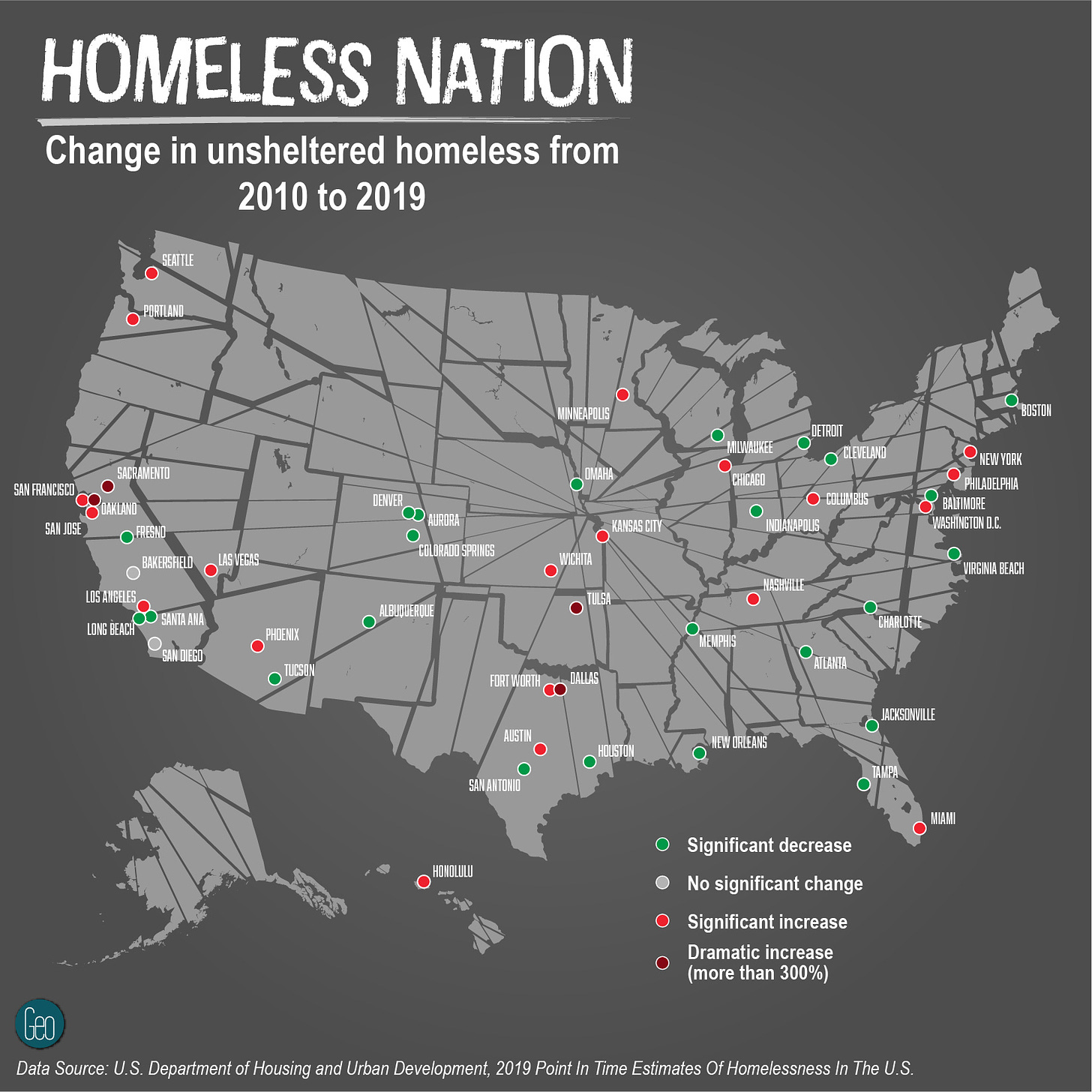
Oh hello again west coast states (and Hawaii)! As shown here, when we take into account the amount of people who are homeless and unsheltered, the west coast really lights up! For those who are curious what an “unsheltered homeless person” is specifically, it’s basically anyone who is physically sleeping on the streets (or in a tent on the street) rather than at a friend’s/family member’s house, or at a shelter.
And so here we see the real difference in just why homelessness is so much more visible in places like Los Angeles, San Francisco, Portland, and Seattle. While New York City had a comparable amount of people who were homeless in total, most of them are in shelters (of some sort). In any of those west coast cities I mentioned, most of the homeless populations are living in tents. It’s a striking difference looking at each coast.
Change in Total Unsheltered Homeless from 2010-2019
And of course here we get to one of the main reasons why places like Portland (which if you’ll remember did not have a significant increase in homelessness from 2010 - 2019) feel like they has more people who are homeless. Since 2010 there’s been a significant increase in the amount of unsheltered homeless in Seattle, Portland, San Francisco, San Jose, and especially Oakland and Sacramento. Which at least helps explain the increase in amount of tents we see lining highways, parks, and other open spaces.
Again, this is all data that is imperfect. But as we look at trends we can definitely start to explain some of the things we see in our everyday lives. Questions like “why are there so many homeless in Portland as compared to Atlanta?” are a little clearer. Despite having similar amounts of total homeless, because Portland has fewer shelters and programs to shelter people who are homeless, they’re far more visible.
Next week I’m going to do a deeper dive on Oregon, Washington, California and -maybe - Nevada so we can see some more of the nuances at play. Same data set though so it will carry the same caveats.


